
my Role
I led the design of this project as a product designer and visual designer.
TEAM
Team of 2 in collaboration with a visual designer. With these team members and the development team, we built the Yellow Card Academy website from scratch to launch.
YEAR
2023
TOOLS
Figma, Lottie, Storybook
overview
Yellow Card Academy was designed to bring simple education to the masses on the transformative potential of cryptocurrency and blockchain technology.
scope
UI/UX, Web Design, Interactive Prototyping, User Research, Visual Design and Branding
kicking things off
There has been a wild shift in the last couple of years about the use of digital currencies, which has grown tremendously as the times and trends changed, which brought about mass adoption of the need and use of cryptocurrency and the effective and efficient use cases, how it has led to financial freedom for many and also financial down-turn likewise.
Which leads to a lot of questions being asked and answers somehow confusing a lot more. People having to need to dig deep and have a wide search for what they need to know and understand simply.
But WHY
From our interviews and feedback from customers, we have come to understand that the majority of them are new to the cryptocurrency as an industry and need a bit of handholding. We also noticed a knowledge gap across the different levels of customers and how well they were versed in the financial market. This brought about the launch of Yellow Card Academy.
"How might we provide the right information and knowledge to the masses needed to navigate the world of cryptocurrency"
what we tend to achieve
So for many trying to learn about this and thinking, “Where do I start from?” and get a simpler understanding of these terms ranging from blockchain technology, trading strategies, market analysis, and financial literacy, Yellow Card Academy is the right place to start.
We also created a clean and visually appealing design that would encourage users to spend more time on the platform. The design was based on a minimalist style, with a focus on typography and a clear hierarchy of information. We also used a color palette that was easy on the eyes and helped users to focus on the content.
To make the academy more engaging, we included cool illustrative style and interactive elements with micro animations. This helped to make it more visually interesting and encouraged customers to interact with the contents.
academy - home to all resources
An intuitive navigation was designed to give users the quickest access to knowledge to be able to showcase the features and other important directories, including a primary call to action to find out more about the academy.
In the hero section, we showcase a title copy that gives visitors an introduction to our value offering and a subtitle that expands on it; the CTA leads to a landing page to give a welcome message that summarises the major topics the academy features and related articles to get started right away.

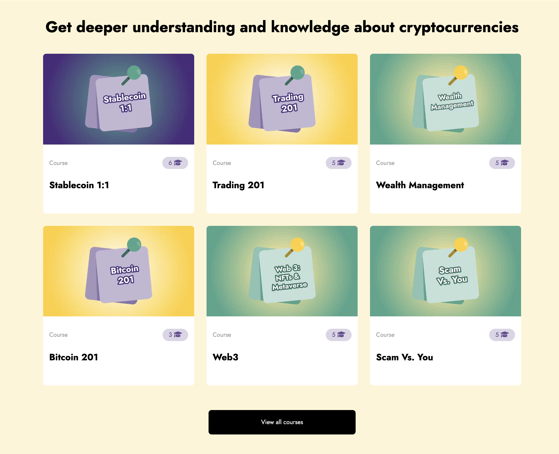
courses
A personal favourite of mine: We got some insights from customers during usability testing that articles help but are not enough, as it is quite difficult to navigate without a pathway.
Courses were then introduced, coming from a list of existing articles and created with insights from customers on the various topics they are most interested in learning about with a pathway setup for easier learning for users.

articles
All resources and short-form content are hosted on the articles page, covering different topics and difficulty levels from beginner up to advanced levels.
Users can filter through contents based on topics and levels to easily get through to their choice of resource


glossary
The glossary section serves as a crypto dictionary that allows customers to read more about crypto jargon and understand the buzzwords better.


takeaway
💡 Retention rates has been, on average, around 30% and retaining 5,000+ monthly active users with visitors maintained globally
I had a very short time designing the website, so we did not really talk to users earlier while designing it, as this was an urgent project to be rolled out as requested by the stakeholders. We have had to iterate on new designs following customers’ feedback and improving the experience and functionality for early and existing crypto adopters in the space


.png)